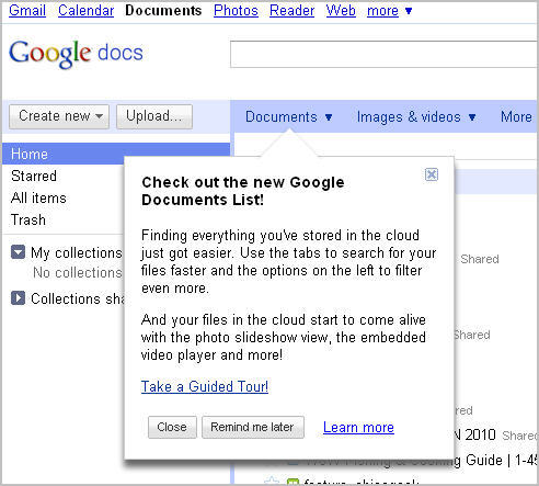
If you’re an enthusiastic Google Docs user like me, you’ll be happy to know that our favorite online document editor just got a facelift.

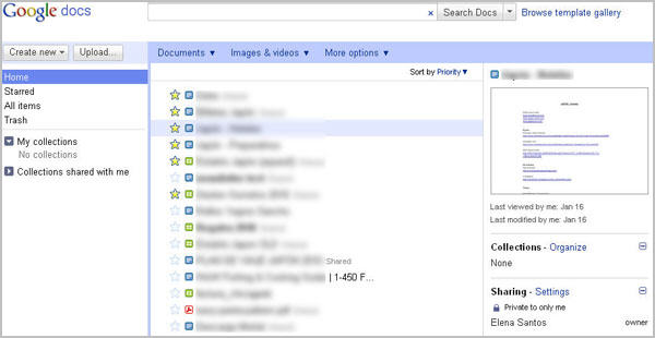
The new Google Docs design is much more similar to Gmail now, with a sidebar on the left featuring quick accesses to the Home page, the Trash and the list of starred items, and a couple of handy buttons to create new documents or upload them from your hard drive. Home can be configured to show only the documents you want to see.
Another new feature in Google Docs is collections. You can now organize documents in collections, and easily share them with your friends. Also, filters have been improved: the top tab bar already lets you filter by type – separating documents from images and videos – and the More options tab gives you more possibilities to filter files: by visibility or ownership.

Finally, if you click anywhere in the row of a given file (not the title, as that will open it) you’ll see a details pane on the right, displaying information about the selected file: who’s got access to it, in which collection it is stored and when it was last viewed or modified, along with a small preview of the document’s content.

